You may have heard of heatmaps before and have wondered to yourself “what does a heatmap on a website even mean?” and you probably aren’t the only person who has thought that. A heatmap is a graphical presentation of data where values are depicted by colour.
The best example of a heatmap would be what you see on the weather report when you watch the news:

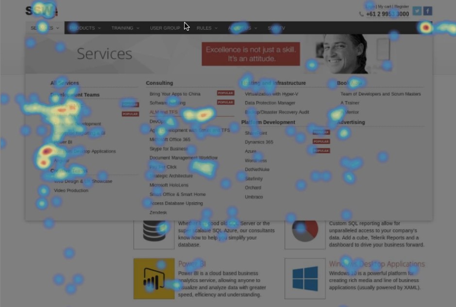
As you can see, the different shades of colours represent different data values on this image, whether it be the heat in a certain area or how intense the weather might be in each region. The same works on a website heatmap as you gather data and start to have different variables represented across certain pages:

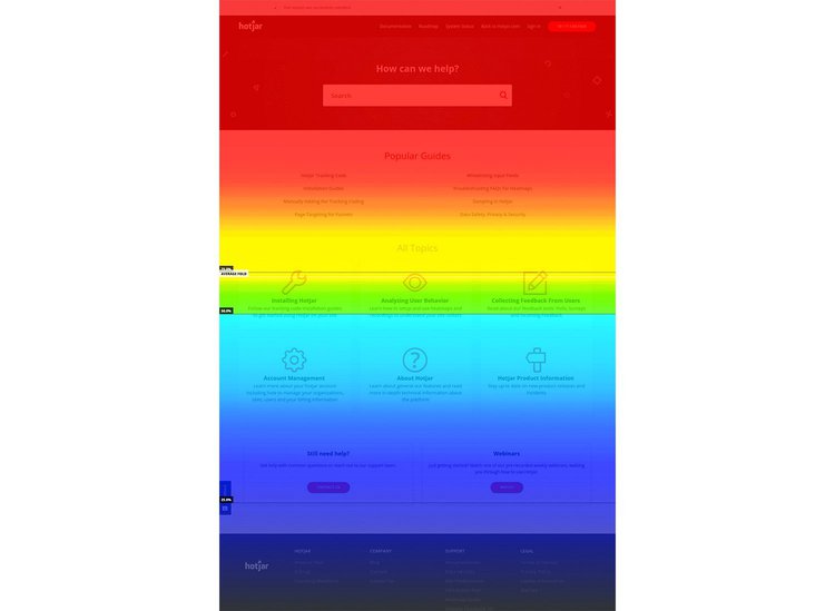
As you can see on the above example, this is showing where users click on the website and the more frequently they click somewhere, the “hotter” the heatmap is and it’s represented by either red or orange data points. This is one of the more popular types of heatmaps, but another interesting one is showing a scrolling heatmap:

This shows how far down the average users will scroll on your website, which can highlight content that is being seen and some content that is being under-utilised. It’s another really interesting insight into your users behaviour on your website and can often provide very helpful intel to make changes accordingly.
How can heatmaps help your business?
Well have a think about it, you may look at your website a few times a day and have an opinion on what you like and dislike about it. This is great, but do you really understand how your potential customers feel about it?

The answer is: You don’t. Heatmaps allow you to truly understand where people navigate on the main pages of your website, they help you understand how far down the page they will actually look at and they also help you identify any gaps or problems on your website that you originally didn’t have any knowledge of.
A good example is a client we were working with who was ADAMANT about having an explainer style video on the home page, under the main banner to help people understand their product better. The client was very confident that this would produce more conversions for their website and be a very popular element on the home page. After testing this theory and installing heatmaps on the home page, we found that from 10,000 users on the website, only 27 of them actually clicked the video and watched it.
With this in mind, we replaced the video with some product information and pricing and the conversion rate of that version of the website increased by 35%, which would never have been identified if heatmaps weren’t installed and the data wasn’t captured.
Heatmaps are an excellent way to uncover what is not working on your website and allows you to strategically redesign these elements for better user experience. Heatmaps are also a major part of our Conversion Rate Optimisation strategy and it often helps support any findings we have in any technical analysis we do.
Last thoughts
In retail, there are various types of market research, stores test their layouts constantly and are always looking to improve the stores performance as best as possible. Why should websites be any different?
Heatmaps are extremely easy to install, there are plenty of providers (Hotjar, Crazyegg, convert.com, etc.) and it can provide some amazing insight that wasn’t available to you previously. It’s a WIN-WIN-WIN!

Do yourself a favour and install a heatmap on your website, it could prove to be one of the better weapons in your arsenal for website improvements. Remember, opinions are just opinions, but strategic decisions supported by data are what can really help improve the experience your customers have on your website.


